Style
|
Follow this guidelines to build successful Web pages:
-
The user should be able to go from top to bottom of each page with at most
3 clicks on the Page Down.
-
The sum of all the images on each page should be no more than 30Kb,
unless requested by the user, who should be previously informed.
Images used in the previous page don't count since they are in the browser's cache.
-
Choose 2, at most 3 colors, as the predominant graphic coloration, unless
you want your page to look like a clown. The same goes for fonts.
-
Use fancy features only when really needed, or you'll be reducing the
number of potential browsers.
-
When using animation effects, don't use more than 2, or you'll lose the
intended eye-catching effect.
-
Keep the elements sparse, with a lot of space in between, otherwise you'll
tire the user.
-
Make sure the elements and text are confortable to read over the background.
-
Leave the status bar alone.
More about this on the sources bellow.
|
Concept
|
Because a Web presence must be coherent, the same concept should be present in
all pages. This includes colors, fonts, structure and object textures.
As an example let's suppose we want to build the graphism of a page related to
a seascape concept.
|
Graphism
|
The creation of the raw graphic elements will follow the steps:
-
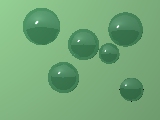
Create a POV-ray source file featuring water drops for the background.
The file Drops.pov
instructs POV-ray to place a few random green glass drops
over a light green table. Rendering the scene in 160x120
outputs:

-
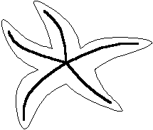
For the logo, draw a starfish in KwikDraw using it's capability to turn a
polygon into a spline (Convert | Poly to Spline),
resulting in something like:
 The source file, Starfish.kwk is in the
Download Area.
Because the starfish needs a texture, apply a crackled, reddish texture
over a cube to get a shaded face and a light face. It will lend a
3D feeling to the starfish when applied on the right areas.
The POV source file for the texture is Starfish.pov.
Sources:
|
Style
| |
 Em Português


 Em Português


